Celebrating 50 with typography logo design inspo
- Deena Englard
- Aug 26, 2024
- 2 min read
I started the Frocks in Stock Learning Center over 3 years ago and over that time have slowly accumulated 49 articles sharing knowledge and design experiences, sometimes even based on daily events at work. Plus a few from some awesome contributors. And now we've reached 50 articles!
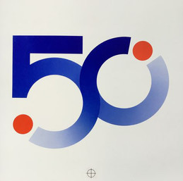
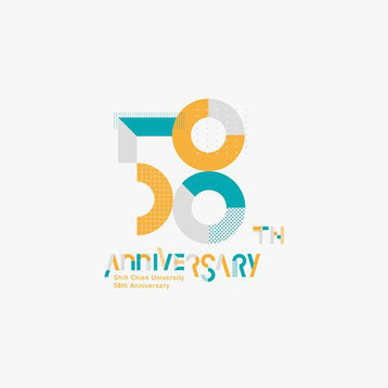
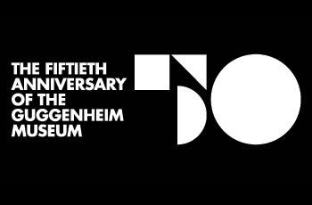
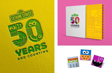
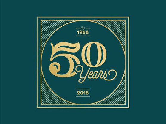
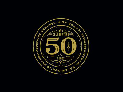
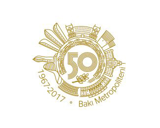
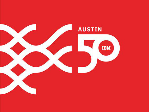
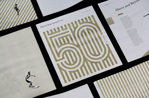
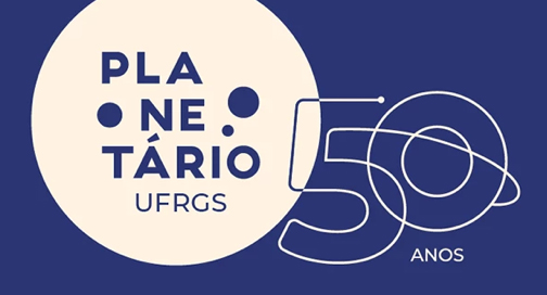
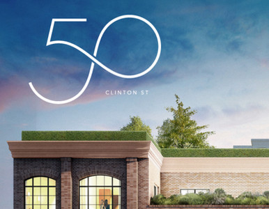
In honor of this milestone, I scoured the internet for cool "50" typography designs to get our creative juices flowing.
The next time you're designing a yeshiva dinner invite - look no further! The inspo you need to get you brainstorming is right here.
I organized the designs by some common threads I noticed:
Creating shapes out of the numbers
Utilizing the negative space in the "0" to add a logo, icon, or image
Adding ornamentation around the typography
Turning a number into an object
Design Concept 1: Shapes
Design Concept 2: Negative Space
Design Concept 3: Ornamentation
Additional Concepts
And for those who made it this far - I found these pieces of design inspo by searching on Pinterest, Dribble, and a little bit of Behance. Mostly Pinterest, if I'm being honest.
Those are my go-to places for inspo (along with online Jewish publications such as The Monsey View).
And now...
Some AI fun!
I played around a bit with Adobe Firefly using the same prompt for all of them and just a different style reference image.
Here's what it looks like - it was surprisingly easy to use!
Tip I discovered: lower the reference image strength all the way down otherwise your image will just look exactly like the reference instead of like your prompt.

Prompts used here:
"number 50 typography created out of balloons for anniversary celebration" or
"number 50 in 3D made out of balloons"


